MEET FEATURE REQUIREMENTS, SCHEDULE, and BUDGET! Consulting available to teach your organization to apply this methodology and tools for powerful quantitative management of your business processes.
- Instruction of your staff at your site, using courseware, application example, and a functional template.
- Mentoring your key staff on an ongoing or periodic basis, on these tools or on Quantitative Program Management.
- Contracting or Employment in your organization on specific topics.
Check out my YouTube Channel: Power Operational Intelligence
Now Live! Overview, Structure, Task Data, Table Design, SQL Server, and Re-Linking now showing.
Video courses covering material on this website, and more, are presented in the playlists.
Code snippet links at YouTube Code Snippets. Twitter at @poweroperation1, #poweropi, #poweroperationalintelligence.
Subscribe on YouTube, and click the "Notification" Bell icon to be notified as content is published.
MS Project Visualization Using MS VisioWhen linked as shown on the projectlinks page, a Microsoft Visio image will illustrate the MS Project plan. 
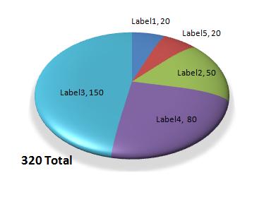
Chart Label Tied to Worksheet CellYou can put a label on an Excel chart tied to data and computation on a spreadsheet. For example, you can reference assumptions, or a total that may not be displayed explicitly in the chart data such as a total on a pie chart. On the spreadsheet, prepare a cell with the desired label content. For example, if a total is displayed in cell Sheet4!B6, in cell A20 enter =B6 &" Total" for example. Good practice would be to name the cell and refer to it by that label, e.g. rngTotal. To put that label on a PivotChart, click the chart area to select it, then from the Ribbon Chart Tools > Format > Insert Shapes > Text Box and click in the chart area to place the box. Then, without entering text in the text box, click in the formula bar and enter =Sheet4!A20 or =Sheet4!rngTotal, and Enter. You must enter this in the formula bar, not directly into the text box. The fully qualified name as shown is required. Contents of cell A20 are then shown in the chart. There are several variations to this, all centered around creating a text box on the chart, and entering a formula into it from the formula bar. The 3-Dimensional Pie Chart article following illustrates use of this technique. 3-Dimensional Pie Chart
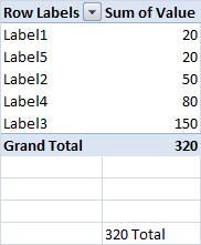
First, create a data table suitable for a Pivot. Sort the table in ascending order of the values to be charted.
Then create a Pivot chart referencing the data table.
Right-Click Chart Area Border > Format Chart Area...
Right-Click outside the pie, and inside the chart area > Format Plot Area...
Click the pie, and the whole object will show selection points (you can later click individual segments to format each)
Right-Click the pie > Add Data Labels...
Right-Click a Data Label > choose font size, font color etc. from the pop-up menu. An Excel template file can be added to Excel, and selected in "Excel Ribbon Insert>Charts>All Charts>Templates>Frisbee" to insert the illustrated 3D Pie Chart on an Excel worksheet. To install the template: right-click the preceding link, "Save Target As…" and download the file to your system. Place the un-zipped .crtx file in directory "C:\Users\Owner\AppData\Roaming\Microsoft\Templates\Charts" or equivalent path on your system to make it selectable as a Chart template.
Create a Total cell on the spreadsheet. For example:
Click the Chart Area Size the Chart Area bounding box and drag a corner to minimize open space around the Pie Chart and Labels. Click and select the Chart Area bounding box, and Copy. Place the pie chart into your target doc or ppt slide using Home > Clipboard > Paste Picture (pic symbol in the popup menu). This preserves the transparent background. Re-size the pie chart in the target doc as needed. |
|